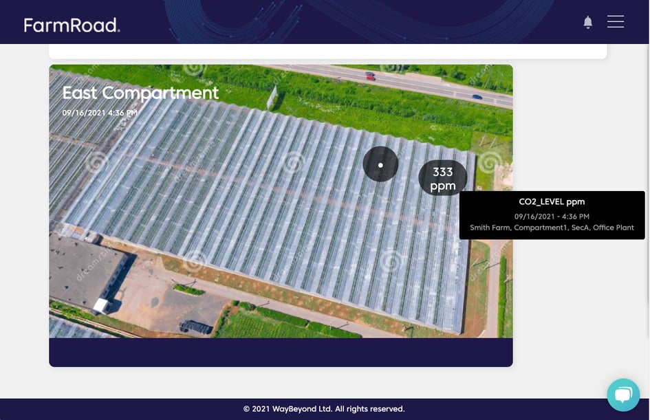

Creating a heat map
- Go to your Data Studio dashboard
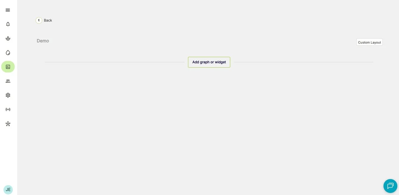
- Click Add graph or widget button at the bottom of the page. You will be presented with the option to select the type of graph or widget that you want
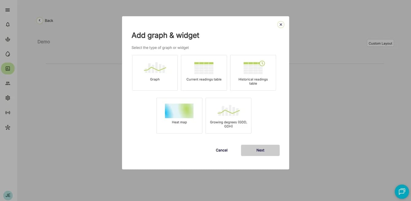
You can add up to 10 heat maps on a single dashboard.
Configuring a heat map
- Give your heat map a name
- Choose whether you want to add an image to your heat map, or a Google Maps location:
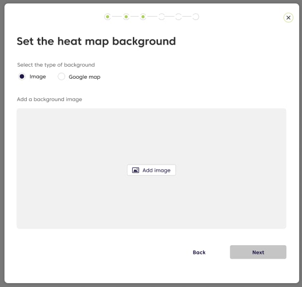
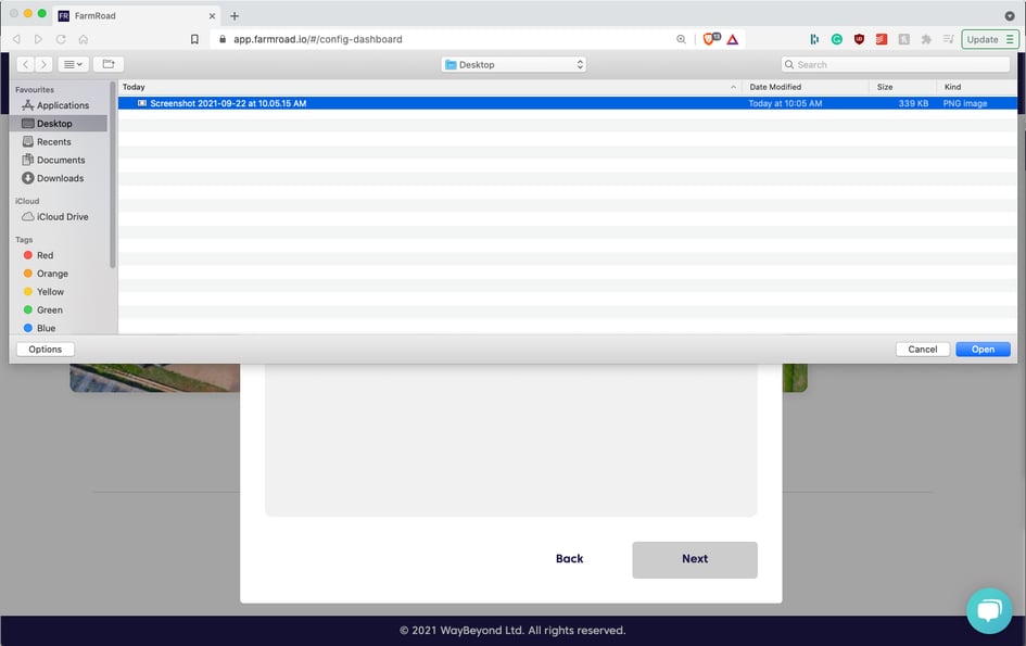
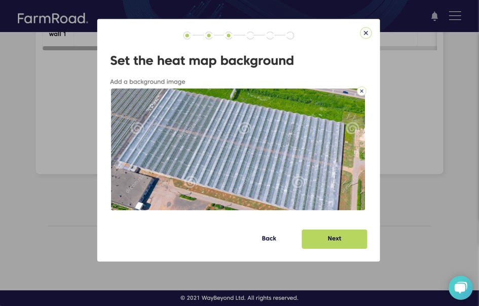
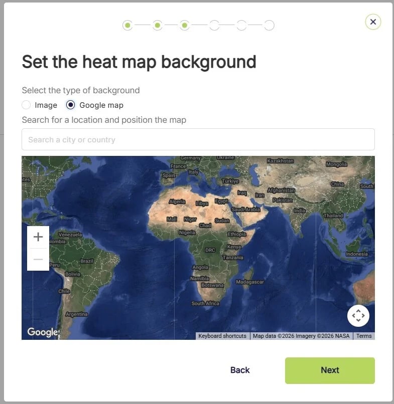
- Once you are happy with your image or Google Map location, click Done
Adding Data to a Heat map
Heat maps support data from integrated sensors like Folium. Heat maps also support data that has been uploaded or manually entered into FarmRoad (this could be Crop Registration or Yield data for example)- Select the data type you would like to display on the Heat map
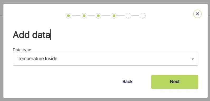
- Select the source of your data
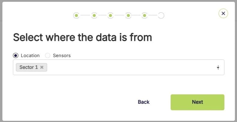
- Sensor data is fed into FarmRoad automatically, think of it like ‘live data’.
- Location data is manually entered or uploaded into FarmRoad. This can be data that is collected with handheld instruments, or crop registration data for example.
Positioning markers on a heat map
- Once you have chosen your data type and sources, you now need to position the markers on the heat map
- Each data source is assigned a marker
- Drag and drop each marker to the corresponding location on your farm. This could be the location of the sensor, or the area where the data was manually collected
- Hovering over the marker will show you the source of the data
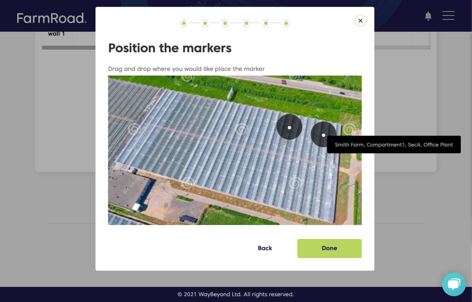
- Once you have positioned your markers, hit Done
Using your heat maps
Once you setup your heat maps you can view the data that is being displayed. Each marker will display the most recent reading Hovering over the marker will give you more information If the marker does not have up to date data, it will be blank